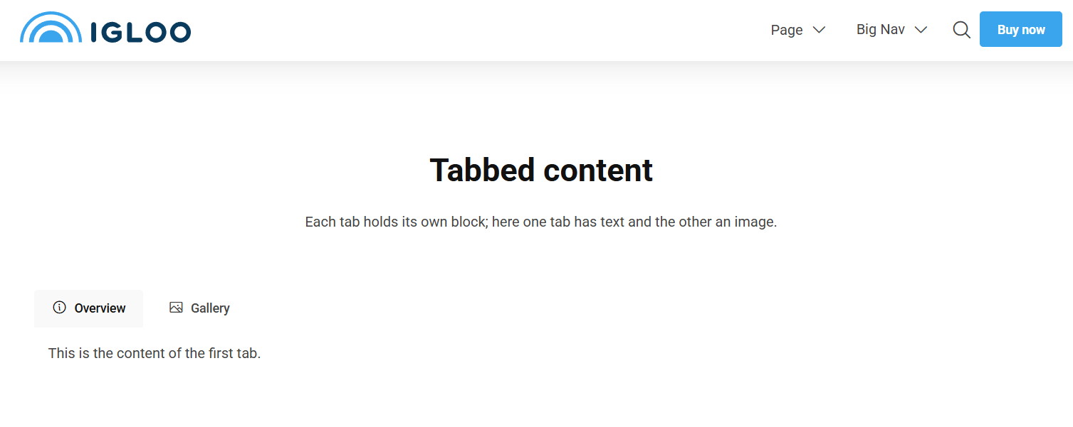
Tabs
The Tabs block lets you organise content into tabbed panels, like the tabs in a browser. Each tab has its own label (and optional icon) and can contain any other blocks — text, images, forms and more — so you can hide large amounts of content behind a compact, clickable navigation.
Structure
Tabs is a nested block made up of three levels:
- Tabs — the container block you add to the grid.
- Tab — each individual tab. You add one Tab per panel inside the Tabs block.
- Tab content — inside each Tab you add the blocks (Text, Image, etc.) that make up that panel.
Content
The Tabs block itself has no fields. Instead it contains a list of Tab items, which you add and reorder inside the block.
Tab
Each Tab item has the following content:
| Property | Description |
|---|---|
| Label | The text shown on the tab button. |
| Icon | An optional icon shown alongside the label, chosen from the icon picker. |
Inside each Tab you can add any other content blocks to build the panel's content.
Settings
| Setting | Description |
|---|---|
| Tab Navigation Pills | Presents the tab navigation as rounded "pills" instead of plain tabs. Usually looks better when there are a lot of tabs. |
| Tab Style | Controls the visual style of the tab navigation. Options: Default (default), Pill, Text. |
In addition to the above, the Tabs block uses the shared common settings and the column span chosen in the grid.
Styling settings apply to the whole Tabs block. Individual Tab items only have the Label and Icon content fields — they have no separate settings.