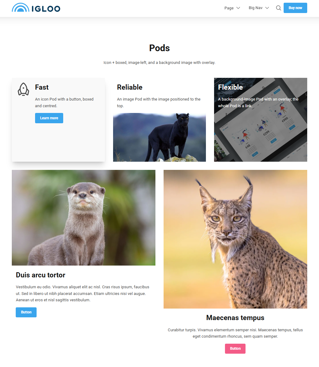
Pod
A Pod is a flexible content card. It combines an optional image or icon with a heading, text and buttons, and can be turned into a single clickable card. Pods are commonly used in rows to build feature grids, service listings or call-to-action tiles.
v13 → v17 change
In v17 the Pod combines the old Pod and Card widgets into a single block. To build a row of cards, add several Pods side by side and resize each to the same width — for example three Pods at 4 columns each for a 3-up row.
Content
| Property | Description |
|---|---|
| Pre Heading | Small text shown above the heading, often used as an eyebrow / category label. |
| Heading | The Pod's main heading. |
| Text | The body text of the Pod. |
| Buttons | An optional list of buttons (see Button). |
| Icon | An icon shown in the Pod, chosen from the icon picker. Cannot be used together with Media. |
| Media | An image or video, chosen from the media library. Cannot be used together with Icon. |
| Link | Makes the whole Pod a single clickable link. |
Icon or Media, not both
A Pod can show either an Icon or a Media item, not both at once.
Settings
| Setting | Description |
|---|---|
| Text Alignment | Horizontal alignment of the Pod's text. Options: Left (default), Center, Right. |
| Vertical Text Alignment | Vertical alignment of the content within the Pod. Options: Top (default), Center, Bottom. |
| Height | Sets the Pod's height as a percentage of the screen height. Options range from 25% to 100% in 5% steps. |
| Image Position | Where the image or icon sits relative to the text. Options: Background, Left, Right, Top, Bottom. |
| Overlay Strength | Strength of the overlay placed over the background media. Appears light or dark depending on the text colour. Options range from 10% to 95% in 5% steps; leave empty for no overlay. |
| Boxed | Draws a box (border / background) around the Pod. |
In addition to the above, the Pod uses the shared common settings and the column span chosen in the grid.