Navigation
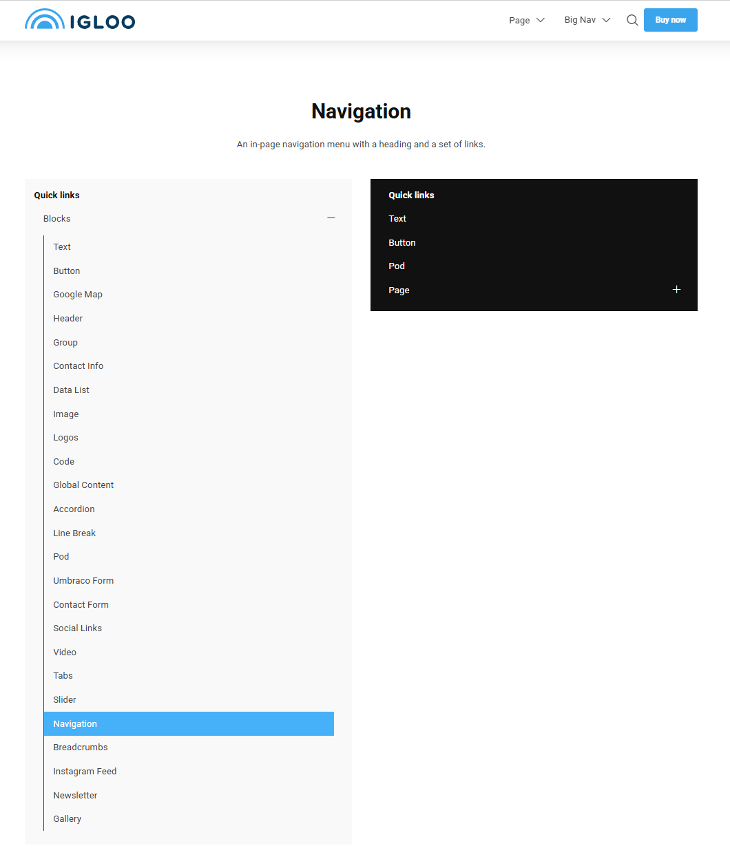
The Navigation block places a navigation menu on the page — useful for in-page section menus, sidebar menus or members areas. It can show a heading, a set of manual links, and optionally expand to show the children of pages in the site tree.
Content
| Property | Description |
|---|---|
| Heading | An optional heading shown above the navigation. |
| Heading Link | An optional link applied to the heading. |
| Links | The list of navigation links. Each link has a Label and a Link. |
| Open Icon | Icon used to expand the menu (e.g. on mobile), chosen from the icon picker. |
| Close Icon | Icon used to collapse the menu, chosen from the icon picker. |
Settings
| Setting | Description |
|---|---|
| Only Render Children | Only the children of the selected pages are displayed. |
| Disable Auto Expand | The navigation will not expand to reveal the current/selected items on load. |
| Levels of Children | How many levels of child pages to display. 0 shows only the selected pages. |
In addition to the above, the Navigation block uses the shared common settings and the column span chosen in the grid.