Header
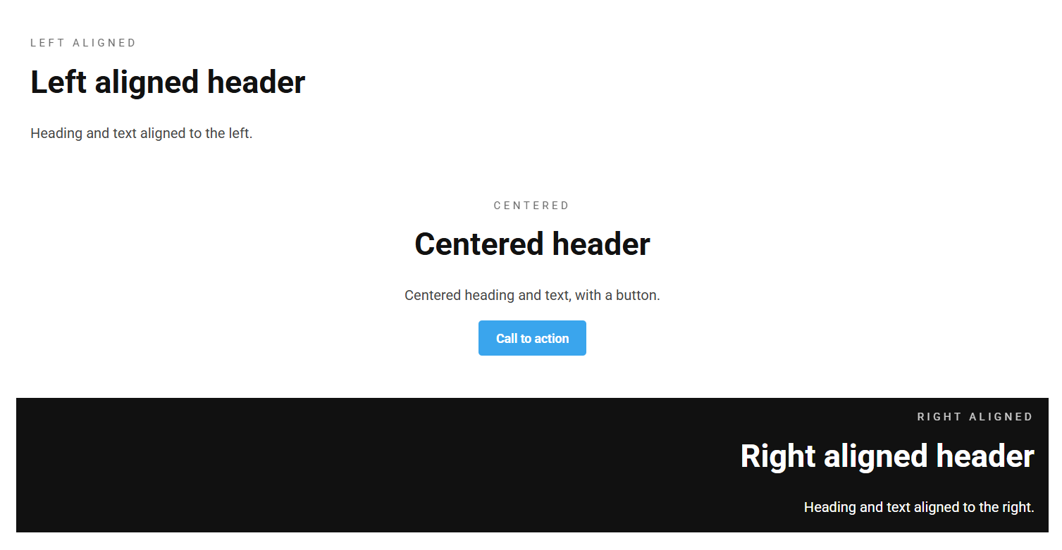
The Header block is a heading-led content block: a pre-heading, a main heading, body text and buttons. Use it to introduce a section of the page.
Content
| Property | Description |
|---|---|
| Pre Heading | Small text shown above the heading, often used as an eyebrow / category label. |
| Heading | The main heading. |
| Text | Body text shown below the heading. |
| Buttons | An optional list of buttons (see Button). |
Settings
| Setting | Description |
|---|---|
| Heading Alignment | Horizontal alignment of the heading. Options: Left (default), Center, Right. |
| Text Alignment | Horizontal alignment of the body text. Options: Left (default), Center, Right. |
In addition to the above, the Header block uses the shared common settings and the column span chosen in the grid.