Gallery
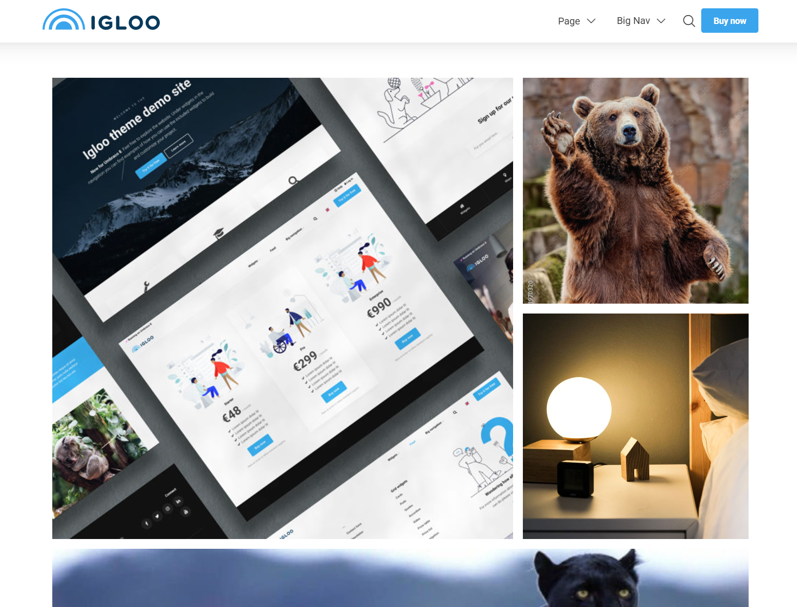
The Gallery block displays a collection of images in a masonry-style layout, with an optional lightbox zoom. Images can be grouped into rows of varying sizes or shown in a simple square grid.
Content
| Property | Description |
|---|---|
| Media | The images to display, chosen from the media library. |
| Group | Groups the images into rows of 1–8. Options: 1–8 (default 2). For example, with 10 images and a group of 8 the gallery shows one row of 8 and one of 2. |
| Simple Grid | Ignores the Group setting and shows the images in a square grid with 4 images per row. |
Settings
| Setting | Description |
|---|---|
| Remove Gutter | Removes the spacing between images. |
| Disable Gallery Zoom | Makes the images non-clickable (no lightbox zoom). |
In addition to the above, the Gallery block uses the shared common settings and the column span chosen in the grid.