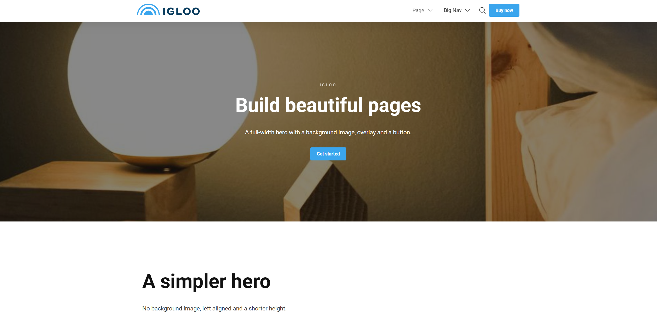
Hero
The Hero is a full-width banner block, typically used at the top of a page. It combines a heading, text and buttons over a background (image, video or other block), with controls for height, overlay and alignment.
Content
| Property | Description |
|---|---|
| Pre Heading | Small text shown above the heading. |
| Heading | The hero's main heading. |
| Text | Body text shown below the heading. |
| Background | The hero background — a single block, e.g. an image or video. |
| Buttons | An optional list of buttons (see Button). |
Settings
| Setting | Description |
|---|---|
| Text Width | Width of the text column over the hero. Options range from 10% to 100%. |
| Height | Hero height as a percentage of the screen height. Options range from 25% to 100% in 5% steps. |
| Overlay Strength | Strength of the overlay over the background. Appears light or dark depending on the text colour. Options range from 10% to 95% in 5% steps; leave empty for no overlay. |
| Text Alignment | Horizontal alignment of the text. Options: Left (default), Center, Right. |
| Vertical Text Alignment | Vertical alignment of the text. Options: Top (default), Center, Bottom. |
| Text Overlay Strength | Strength of an overlay placed directly behind the text for legibility. Leave empty for none. |
In addition to the above, the Hero block uses the shared common settings, a container width option, and the column span chosen in the grid.