Feed Listing
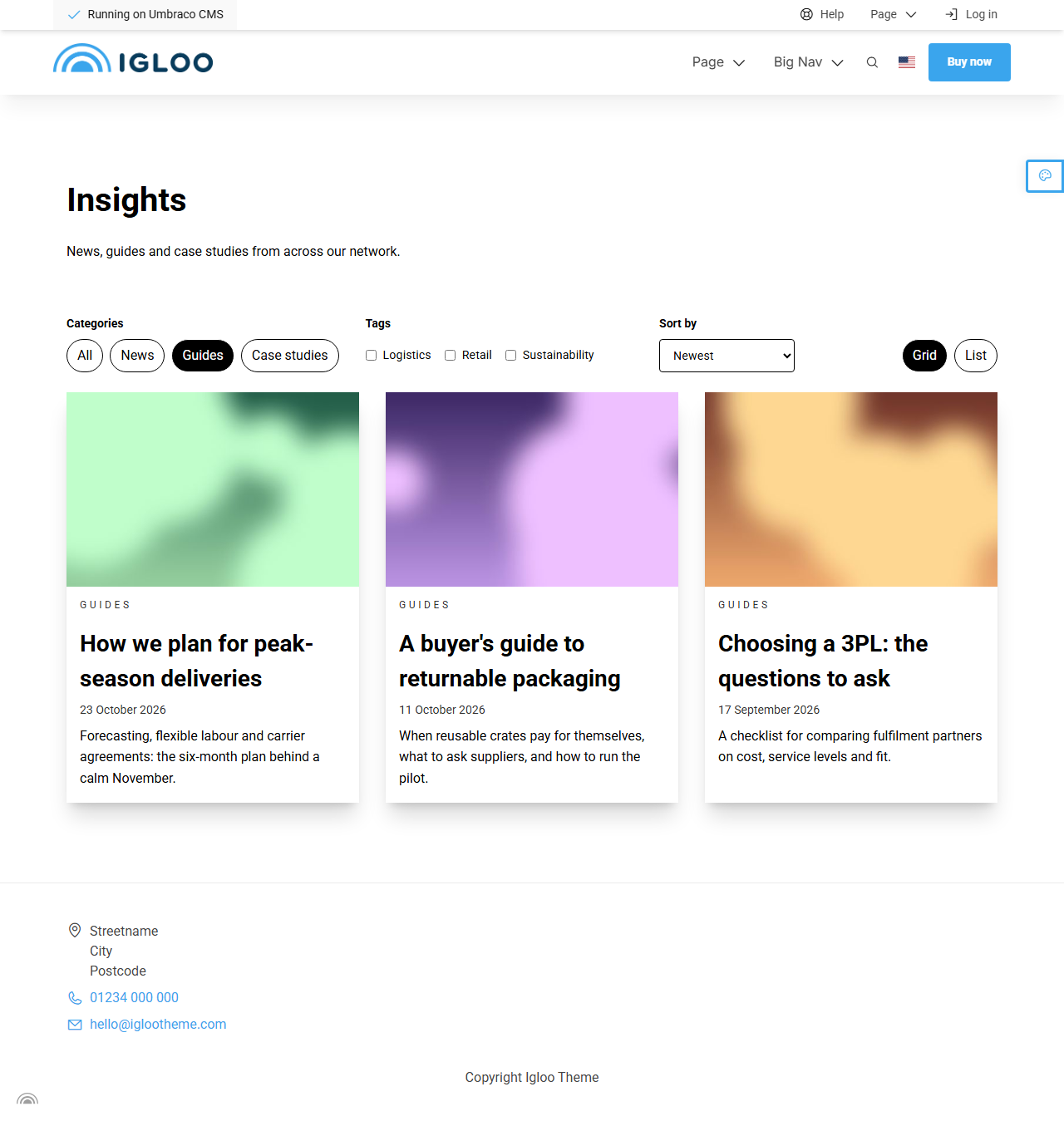
The Feed Listing block lists the items of a Feed as cards, with paging and optional category and tag filters, sort options and a grid/list switch. It's usually placed on the Feed page itself: a Feed lists nothing until you add one.
To show just a few of the newest items on another page, use Latest from Feed instead.
The Feed Listing always spans the full width of the page. Use Maximum Number of Columns to control how many cards sit side by side.
Content
| Property | Description |
|---|---|
| Feed | The Feed to list. Leave empty to use the current Feed (see Infer Feed). |
| Infer Feed | Uses the current Feed when no Feed is picked. On by default. |
| Pre Heading | Short text shown above the heading. |
| Heading | The heading text and its size. |
| Intro | An introduction shown above the cards. |
| Empty Text | Shown when no items match, for example after a visitor filters. |
| Maximum Number of Columns | How many cards sit side by side. Leave empty for 3. Fewer columns are used on smaller screens. |
Settings
Rendering
| Setting | Description |
|---|---|
| Layout Modes | Grid, List or both. Tick both to let visitors switch; the first is the default. Defaults to Grid. |
| Show Sort Options | Lets visitors change the order. |
| Default Sort Option | The starting order: Newest, Oldest, Title A to Z, Featured or Manual. Leave empty to use the Feed's Item Sort Order. |
| Max Items Per Page | How many items per page. Leave empty for 9. |
| Pagination | Numbered (default) page links, a Load more button, or None. |
| Show Category Filter | Lets visitors filter by category. |
| Category Filter Style | Links (default), Checkboxes or Dropdown. |
| Show Tag Filter | Lets visitors filter by tag. Only tags used by the listed items are offered. |
| Tag Filter Style | Links (default), Checkboxes or Dropdown. |
| Preset Categories | Only list items in these categories. |
| Preset Tags | Only list items with these tags. |
| Tag Match | Whether items need Any tag (default) or All tags of the preset tags. |
| Featured First | Lists items marked Featured before the rest. |
| Exclude Current Item | Hides the item being viewed, when the listing sits on a Feed Item page. |
| Button Style | The button style for the page links and the Load more button. |
| Filter Button Style | The button style for the category and tag links and the Grid/List switch. Leave empty to use the Button Style. |
How filters combine
- Picking several categories, or several tags, shows items that match any of them.
- Using the category filter and the tag filter together shows items that match both.
- Preset categories and tags always apply on top of what the visitor picks.
Filtered and paged views have their own address (for example ?category=events&page=2), so visitors can bookmark or share them. Filters work without JavaScript too.
Card settings
These settings are on the Feed Item tab and control how each card looks. The same settings are used by Latest from Feed and the Related Items widget.
| Setting | Description |
|---|---|
| Text Alignment | Options: Left (default), Center, Right. |
| Vertical Text Alignment | Options: Top (default), Center, Bottom. |
| Image Position | Where the image sits on the card: Top (default), Bottom, Left, Right or Background. |
| Image Aspect Ratio | Options: Original, 16:9, 3:2 (default), 4:3, 10:7, 1:1, 3:4. |
| Overlay Strength | How dark the overlay is when the image is the card background, from 10% to 95%. |
| Boxed | Draws a box around each card. On by default. |
| Palette | The palette for the cards. |
| Show Image | On by default. See Images for which image is used. |
| Card Heading Level | The heading level for each card's title, H2 to H6. Defaults to H3. |
| Show Date | On by default. |
| Show Summary | On by default. |
| Show Category | Shows the category above the heading. On by default. |
| Show Tags | Off by default. |
| Show Author | Off by default. |
| Read More Text | Adds a "read more" link with this text. Leave empty to make the whole card the link. |
| Read More Button Style | The button style for the read more link. |
In addition to the above, the Feed Listing uses the shared common settings.