Common Settings
Almost every block in the Block Grid shares the same base set of settings and the same way of controlling its width. Rather than repeat these on every block page, they're documented once here. Individual block pages link back to this page and only list the settings that are unique to them.
In v13 each widget had its own Column Width property. In v17 you set a block's width by resizing it directly in the grid editor, there is no width dropdown. The available widths are listed under Column span below.
Column span
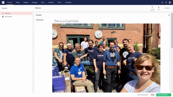
The content area is a 12-column grid. You set a block's width by resizing it in the grid drag the block's edge until it spans the number of columns you want. This is the only way to set a block's size, and sitting several blocks side by side is how you build multi-column layouts.
Blocks can be resized to one of the following widths:
| Columns | Roughly |
|---|---|
| 3 | 25% width |
| 4 | 33% width |
| 6 | 50% width |
| 8 | 66% width |
| 9 | 75% width |
| 12 | 100% width |
This subset of allowed sizes helps editors keep columns at reasonable, consistent sizes.
To place blocks beside each other, add them to the same row and resize each so their widths add up to 12 or less. For example, for a three-column row resize each block to 4 columns (4 + 4 + 4 = 12); for a two-thirds / one-third layout, resize one block to 8 columns and the next to 4. To force a new row, start the next block on a fresh line in the grid. Full-width layout blocks such as Section and Hero always span the full 12 columns.
Container width
Some blocks including Section, Group, Hero, Breadcrumbs and Section Navigation let you choose how wide their inner content sits within the page.
| Width | Description |
|---|---|
| Small | Narrow centred container. |
| Standard | The default content width. |
| Big | Wider centred container. |
| Full width | Spans the full width, edge to edge. |
Block settings
These appear on the Settings tab of nearly every block.
| Setting | Description |
|---|---|
| Alias | A friendly label for the block. Used for display purposes in the editor only. It has no effect on the front end. |
| Anchor Id | Adds an id to the block so it can be targeted by anchor links (e.g. linking to #contact further down the page). |
| Custom CSS Classes | Adds one or more CSS classes to the block. Pair this with your own Custom CSS to style an individual block. |
| Palette | Applies one of the theme's design palettes (background/text colour combinations) to the block, chosen from the palette picker. Leave empty to inherit the surrounding palette. |
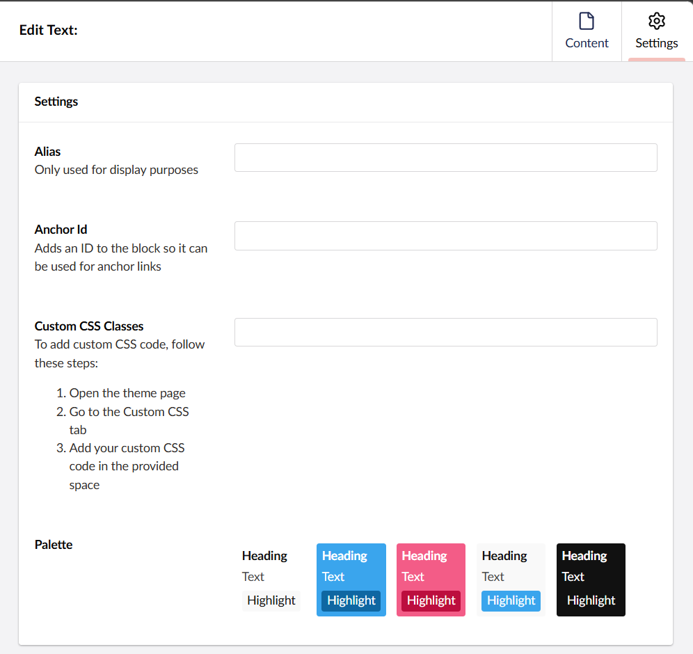
Settings panel
Open a block's settings by clicking the cog / settings icon on the block in the grid. Content (the block's actual data) and Settings (how it looks and behaves) are edited in separate tabs of the same overlay.