Button
The Button block adds one or more buttons (calls to action) to the page. The same button configuration is reused by other blocks that contain buttons, such as Text, Pod and Header.
Content
| Property | Description |
|---|---|
| Buttons | A list of buttons. Add, remove and reorder buttons here; each button has the fields below. |
Each button
| Property | Description |
|---|---|
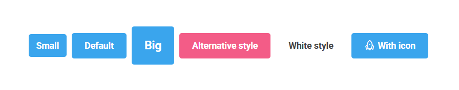
| Text | The label shown on the button. |
| Link | Where the button goes (content, media, external URL or email). Required. |
| Icon | An optional icon shown on the button, chosen from the icon picker. |
| Size | Button size. Options: Small, Default (default), Big. |
| Style | The button's visual style, chosen from the theme's button variants (defined by the active design palette). |
Settings
The Button block has no settings of its own. It uses the shared common settings and the column span chosen in the grid.