Accordion
The Accordion block shows a list of expandable items, each with a title that reveals its content when clicked. It's ideal for FAQs and other content you want to keep compact until needed.
Content
| Property | Description |
|---|---|
| Items | A list of accordion items. Add, remove and reorder items here; each item has the fields below. |
Each item
| Property | Description |
|---|---|
| Title | The clickable heading for the item. Required. |
| Text | The content revealed when the item is expanded. |
Settings
| Setting | Description |
|---|---|
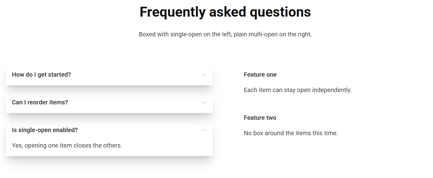
| Boxed | Isolates each accordion item in its own box. |
| Single Open | Forces only one item to be open at a time (opening one closes the others). |
In addition to the above, the Accordion block uses the shared common settings and the column span chosen in the grid.