Item Layout
Every item page in a Feed uses the same layout: the Item Layout tab on the Feed. You build it with blocks, like a page, using the Feed Item widgets below to place each part of the item (its heading, date, image, body, share buttons and so on). Change the layout once and every item in the Feed follows.
Because each Feed has its own layout, a "News" Feed can show dates, share buttons and comments while a "Partners" Feed shows just the heading, image and content.
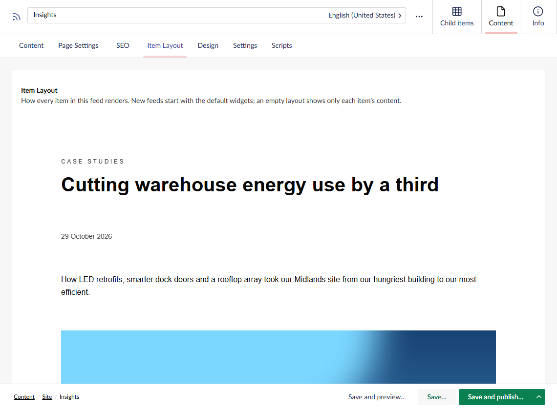
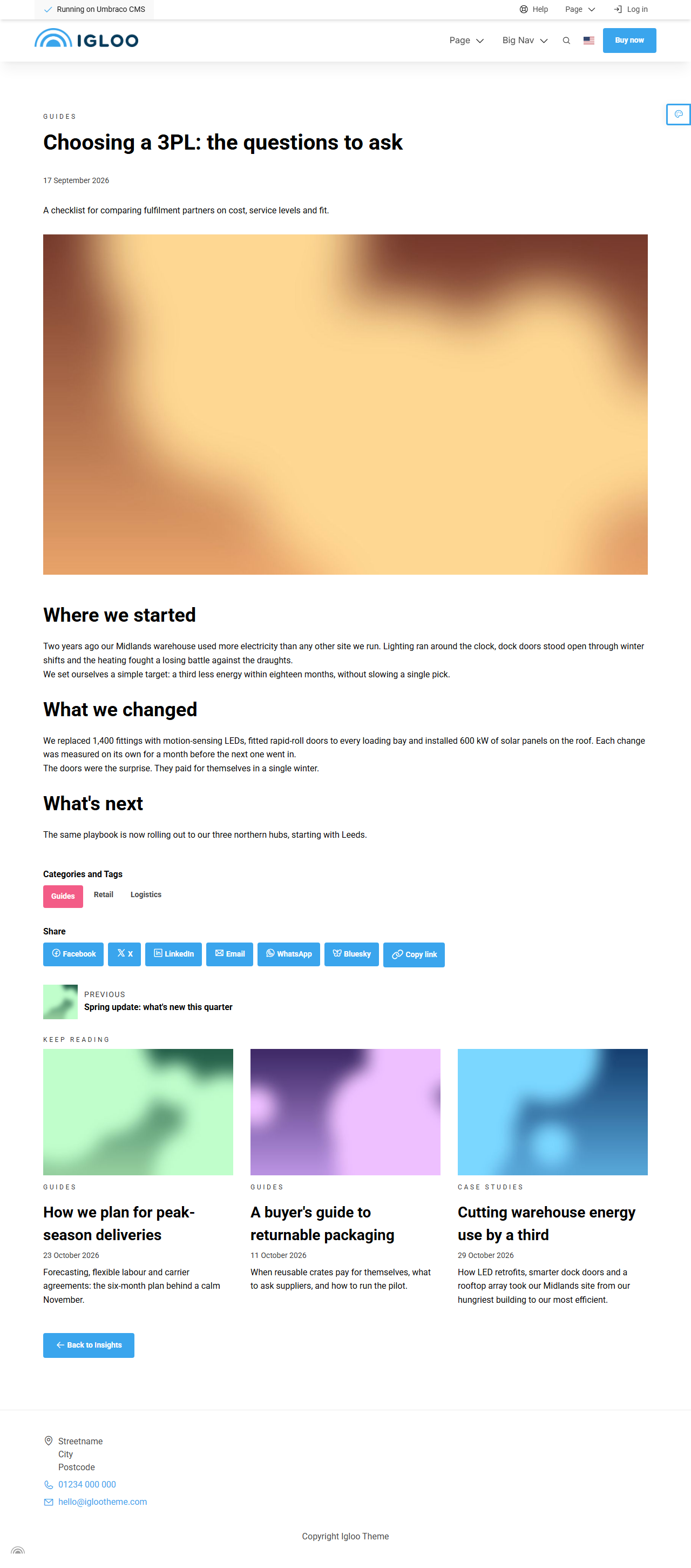
Here's an item page from a Feed whose layout also has Previous / Next and Back to Feed widgets:
The default layout
A new Feed starts with a layout already filled in: a Section holding these widgets, in this order:
- Heading (with the pre-heading)
- Date
- Author
- Intro
- Image
- Content
- Category and Tags
- Share
- Comments
- Related Items
Move, remove or restyle any of them, and add others such as Previous / Next or Back to Feed. You can also add any standard block, for example a call to action that should appear on every item.
If you remove every block, item pages show only each item's own content.
While you edit the layout, the widgets preview using the newest published item in the Feed. If the Feed has no published items yet, each widget shows "publish an item in this feed to preview it" instead.
Feed Item widgets
The widgets are in the Igloo Feed Item group of the block picker, and are only available in an Item Layout. Each one shows the matching field of the item being viewed, and shows nothing when the item has no value for it, so an item without an author simply has no author line.
All widgets also have the shared common settings.
Heading
Shows the item's Heading, and its Pre Heading above it.
| Setting | Description |
|---|---|
| Heading Level | H1 (default), H2 or H3. Keep one H1 per page. |
| Show Pre Heading | Shows the item's pre-heading above the heading. On by default. |
| Text Alignment | Options: Left (default), Center, Right. |
Date
Shows the item's Date, written in the visitor's language.
| Property / Setting | Description |
|---|---|
| Label | Text shown before the date, for example "Published". |
| Date Format | Options: Long (7 February 2026, default), Short (7 Feb 2026), Numeric (07/02/2026). |
Author
Shows the item's Author.
| Setting | Description |
|---|---|
| Variant | Byline (default) for a short "By" line, or Bio card for the author's photo, role and description. |
| Show Image | Shows the author's photo. On by default. |
Intro
Shows the item's Intro.
| Setting | Description |
|---|---|
| Text Alignment | Options: Left (default), Center, Right. |
| Text Size | Options: Small, Normal (default), Big. |
Image
Shows the item's main image or its card image.
| Setting | Description |
|---|---|
| Image Source | Main image (default) or Card image. |
| Aspect Ratio | Options: Original, 16:9, 3:2 (default), 4:3, 10:7, 1:1, 3:4. |
| Image Width | How much of the space the image fills, from 10% to 100%. |
| Show Caption | Shows the image's alt text below it as a caption. |
Content
Shows the item's own Content blocks. It has no settings. Without this widget, the item's body doesn't appear.
Category and Tags
Shows the item's category and tags.
| Property / Setting | Description |
|---|---|
| Heading | An optional heading above the category and tags. |
| Show Category | On by default. |
| Show Tags | On by default. |
| Link to Feed | Links each category and tag to the Feed, filtered by it. On by default. |
| Category Button Style / Tag Button Style | The button style for the category and tags. Leave empty for a plain pill. |
Share
Share buttons for the item page.
| Property / Setting | Description |
|---|---|
| Heading | An optional heading above the buttons. |
| Networks | Which buttons to show: Facebook, X, LinkedIn, Email, WhatsApp, Bluesky, Copy link, Native share. Leave all unticked to show every one. Native share opens the device's own share menu and only shows in browsers that support it. |
| Style | Icons (default) or Icons and labels. |
| Alignment | Options: Left (default), Center, Right. |
| Button Style | The button style for the share buttons. Leave empty for a plain pill. |
| Icons tab | Pick a different icon for any network. Leave empty for the default icon. |
Comments
Shows Disqus comments for the item.
To turn comments on:
-
Create a site in your Disqus account and note its shortname (in Disqus, under your site's settings).
-
In Umbraco, open your General settings node, go to the Access tab and enter the shortname under Disqus. Save and publish.

-
Make sure the Feed's Item Layout has a Comments widget. New Feeds already have one.
To turn comments off for a single item, tick Disable Comments on that item. To turn them off for a whole Feed, remove the Comments widget from its layout.
| Property / Setting | Description |
|---|---|
| Heading | An optional heading above the comments. |
| Provider | Disqus. |
| Load On | When the comments load: Page load, Scrolled into view (default) or Click (a "Show comments" button). Loading later makes the page faster for visitors who never reach the comments. |
| Button Style | The button style for the "Show comments" button. |
The widget shows nothing until a Disqus shortname is saved in the General settings, and it never loads comments in the backoffice preview: check the published item page instead. Only one Comments widget shows per page.
Related Items
Shows other items from the same Feed as cards. Items picked in the item's Related Items field come first, then the rest are filled in automatically.
| Property / Setting | Description |
|---|---|
| Pre Heading, Heading | Optional text above the cards. |
| Buttons | Optional buttons below the cards. |
| Number of Items | How many items to show. Leave empty for 3. |
| Strategy | How the remaining spaces are filled: Same category and shared tags (default) shows the items most like this one, Newest shows the newest items. |
| Show More Link | Adds a link to the Feed below the cards. On by default. |
| Show More Button Style | The button style for that link. Leave empty for a plain link. |
The cards use the same card settings as the Feed Listing.
Previous / Next
Links to the previous and next items, in the Feed's sort order. Not in the default layout.
| Property / Setting | Description |
|---|---|
| Previous Label, Next Label | The link text. Leave empty for "Previous" and "Next". |
| Show Titles | Shows the other items' headings. On by default. |
| Show Images | Shows the other items' card images. |
Back to Feed
A link back to the Feed. Not in the default layout.
| Property / Setting | Description |
|---|---|
| Text | The link text. Leave empty for "Back to" and the Feed's name. |
| Button Style | Shows the link as a button. Leave empty for a plain link. |