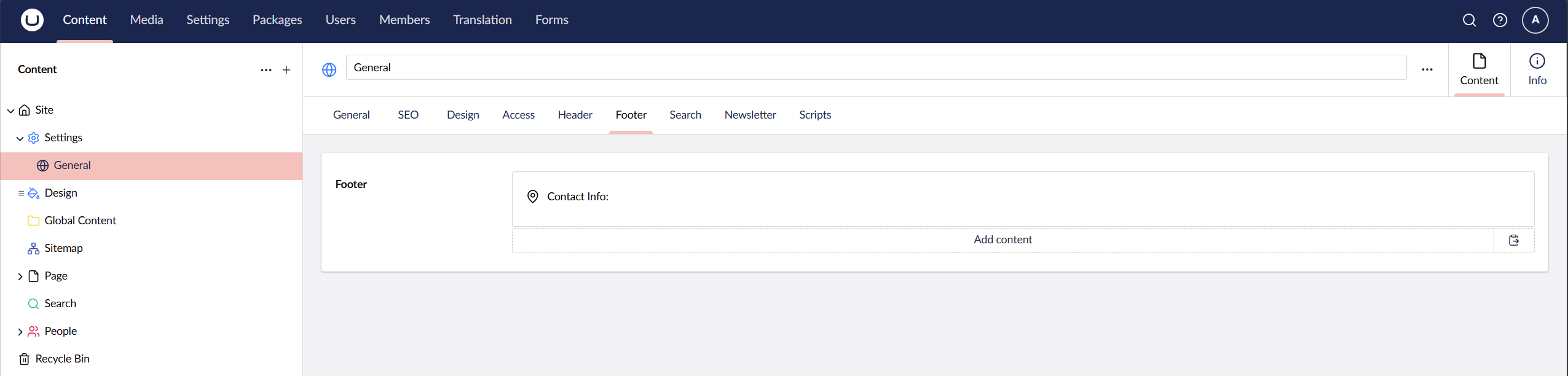
Footer
The footer is built up using blocks, these blocks can be found on your General Settings node under the tab Footer. You can control the width for each block and control the alignment.
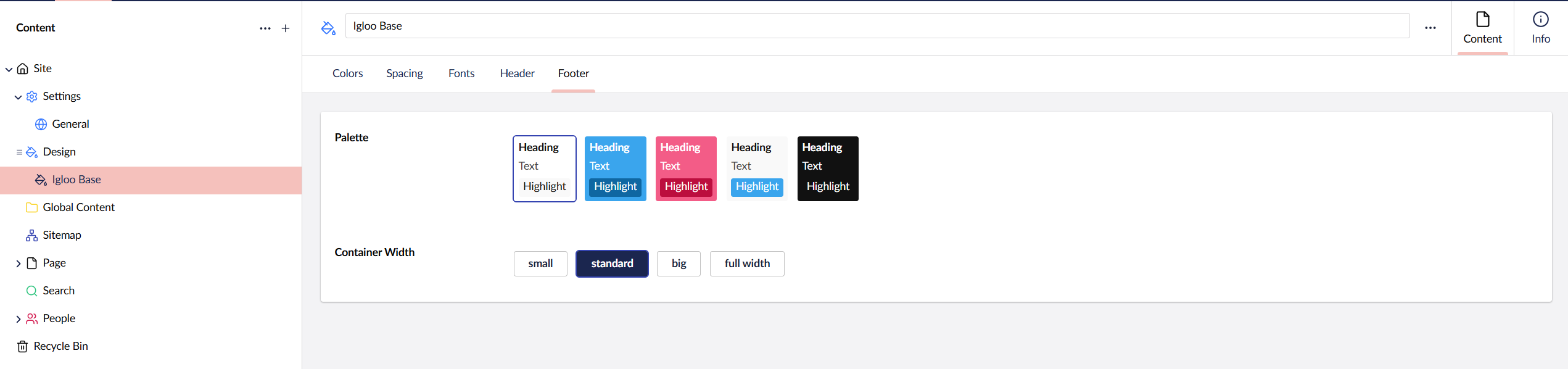
The footer will use the Palette set on the Design node you set under the Footer tab. Here you can also set the footer Container Width.
Available Blocks
| Name | Description |
|---|---|
| Text | Simple text block, you can also add buttons here. |
| Button | Simple button list block. |
| Google Map | Show a map of a specific location. |
| Contact Info | Shows your address, phone number and email. |
| Image | Simple Image block. |
| Data List | Shows paired text side-by-side. |
| Header | Text block with header and pre-header options. |
| Navigation List | Prints out links that you add. |
| Pod | Versitily block to display text and images together. |
| Line Break | Creates a line break horizonal rule. You can set a custom height and also display a small divider. |
| Accordion | Expandable text content. |
| Logos | List of logos with customisable size. |
| Global Content | Pick a block grid from a reusable source. |
| Code | Allow you to add custom HTML code to the footer. |